Women Techmakers brand refresh, Spring-Winter 2019
Google’s Women Techmakers organization strives to provide visibility, community, and resources for women in technology. In early 2019, they asked our team to update their logo so that it would more closely align with existing Google logos, but still maintain a visual independence. In stages, that one project evolved into an overall brand refresh to modernize the visual look of Women Techmakers, and bring consistency to their presence in both digital and physical realms. The final design system and tools had to be created and organized to be accessible and “legible” to people within and outside of Google, as well as both designers and non designers alike.
Logo:
Graphic elements:
Through explorations in how to modernize their trademark brush stroke graphics and emphasize the human quality of the organization, we developed a suite of designs that utilized their existing brush stroke assets to maintain consistency, and developed rules of application that would maintain Google’s emphasis on white space, while also playing an active role in communicating the content. The collection includes design examples and templates that can be used online, in print, and on the web to ensure the brand standards were modular to a variety of applications and contexts.
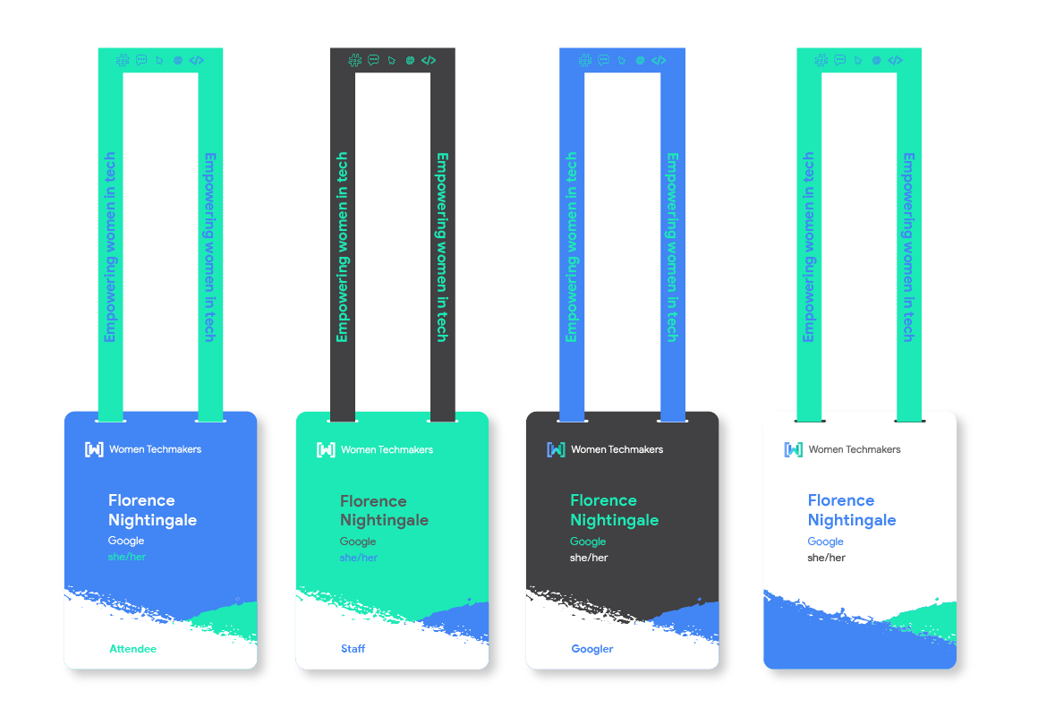
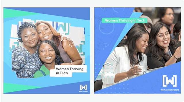
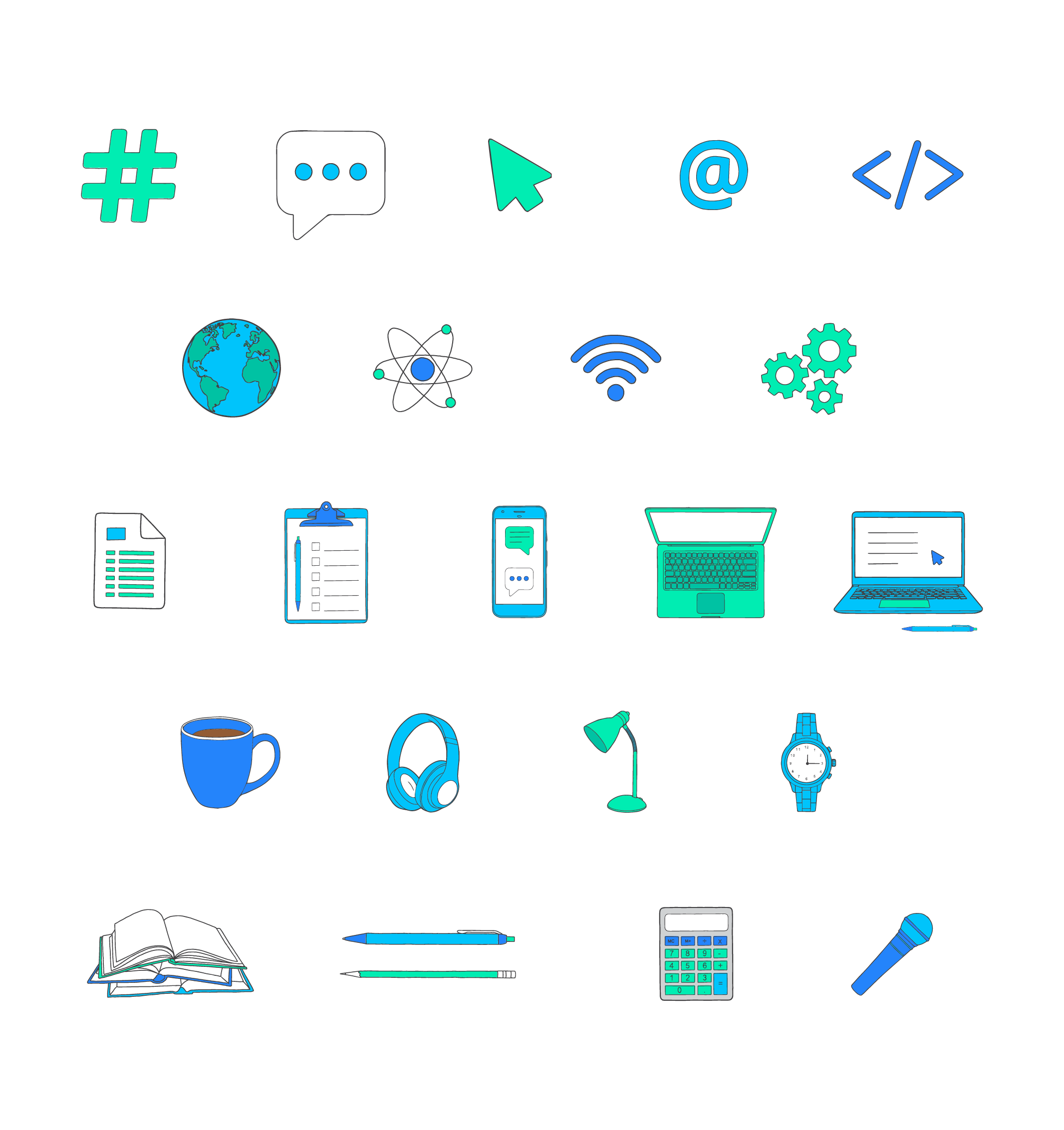
Illustration & photography: To help WTM best represent and communicate to their member base and audience, the brand guidelines emphasize using photography to depict people, and using illustrations to support more informational communication. I strategized with artist and teammate Virginia Poltrack to create a unique illustration style and sticker sheet of elements to serve as a resource for the WTM team and designers who might work with the organization in the future.


Iterations: